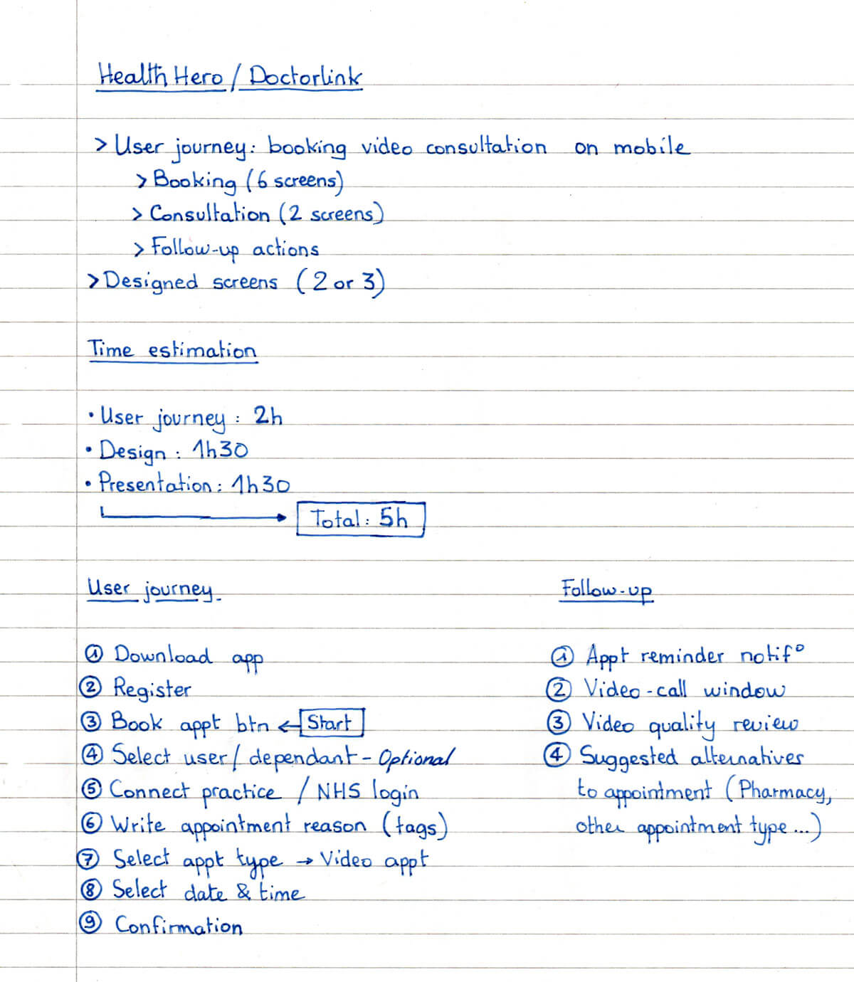
Health Hero
DoctorLink appointment booking
Timeline
May 2021
Course
Visual Interaction Design
Type
Product Design, UI/UX
Tools
Figma, Miro, Illustrator
Discovery / User Flow
Before starting a project, it’s important to understand as much as possible what is being asked. Establishing priorities is a good starting point for me to evaluate how long each step should take me.
During this first step, I defined what the assignment is asking, selected the screens I judged good for the task, and wrote some initial notes that I already had in mind.
For the flow, as it’s pretty straightforward, a list of steps was enough, but when there are more options available to the user, it can be handy to make a diagram to show every possible interaction.
The ones that I decided to keep are the following:
- Write the reason for your appointment.
- Select what kind of appointment you want.
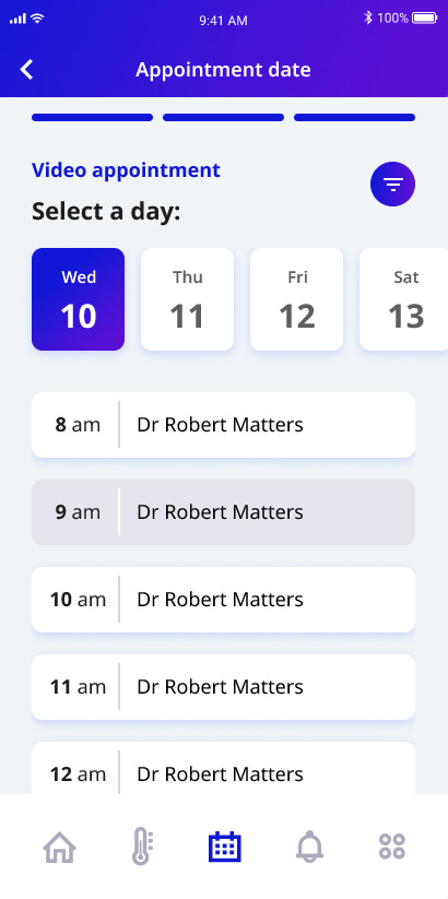
- Select a time and a date with the doctor of your choice.
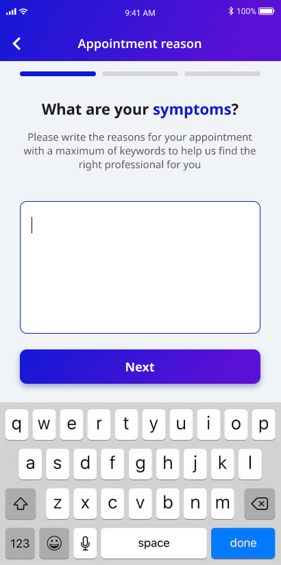
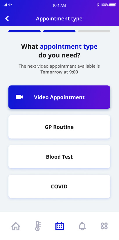
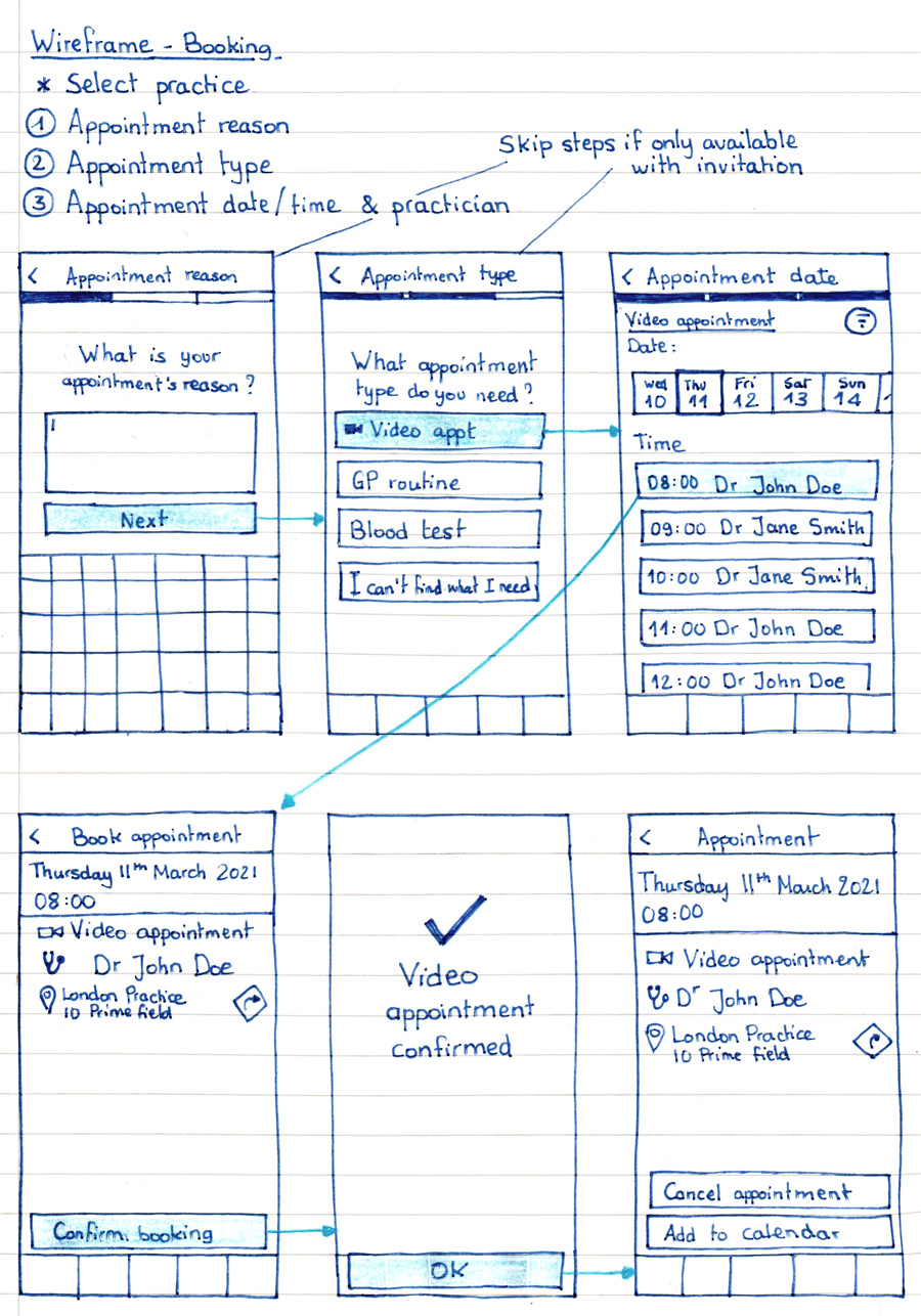
Wireframe - Booking
Once I knew roughly what I wanted, I started sketching. The fastest and easiest way for me to create reliable wireframes is to avoid using computers. I find it faster and easier to focus on concepts when I don’t have to struggle with complicated tools.
For this project, I defined 3 main steps in order to book a video appointment:
- Providing appointment reason
- Selecting appointment type
- Choosing appointment date
I was missing some instructions/information so I decided to leave them as notes:
- Are the users already registered with a Practice when they start their booking?
- Are they invited to book or can they book an appointment whenever they want?
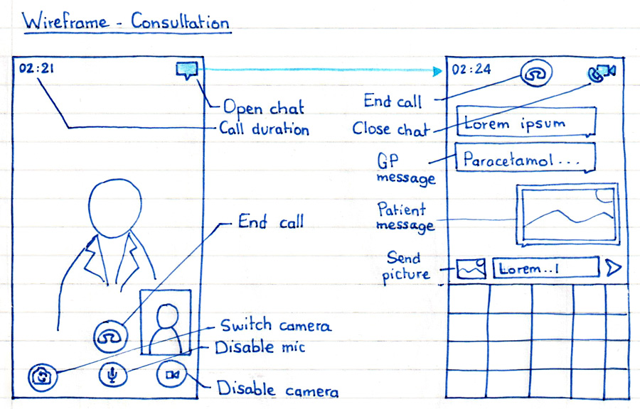
Wireframe - Consultation
For this step, I wasn’t too sure about what kind of solution we were talking about so I assumed it was the interface proposed to the user when they receive a call from their GP.
As an initial draft, I focused on simplicity with only one additional feature that I thought could be nice to have.
During video calls, an annoying thing to do is to keep exchanging files and text, especially if it needs to be done on another app.
I tried to create an option for the user to switch to a “text mode” to be able to write down things they can’t pronounce properly or send pictures they could take instead by showing it on the video to their GP without any record of it.
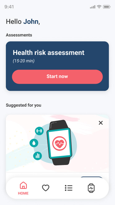
Health Risk Assessment
Timeline
June 2021 - August 2021
Course
Visual Interaction Design
Type
Product Design, UI/UX
Tools
Figma, Miro, Illustrator
Discovery / Userflow
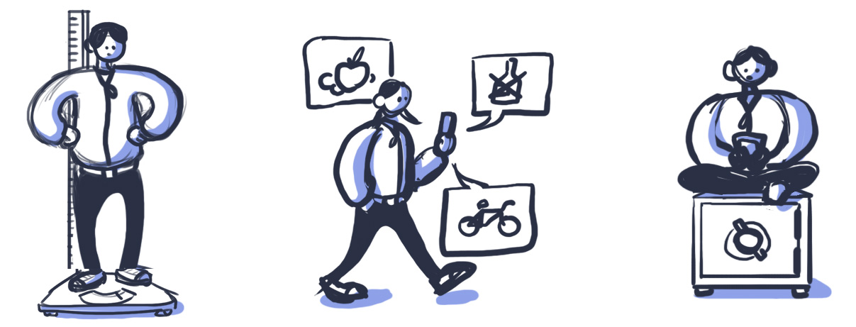
As a preliminary phase, I started framing problems the app should solve. I discovered the existence of apps with similar goals and focused on what to do with the health risk results. The main use for the app was to provide insurance or regular companies with health info about their employees/clients.
The main problem to solve was:
How to make users open the app again after taking their health risk assessment?
The few ideas we developed were:
- Setting goals for the users to improve their lifestyle.
- Sending them notifications for goal reminders.
- Showing a to-do list with goal dates.
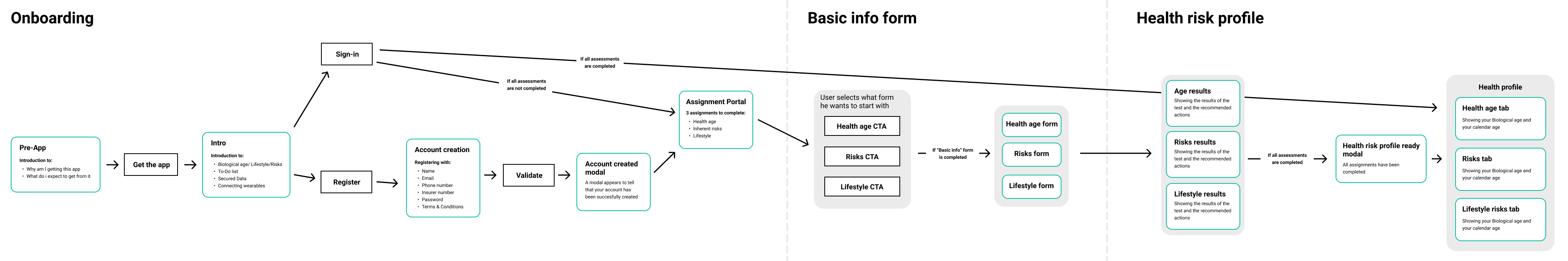
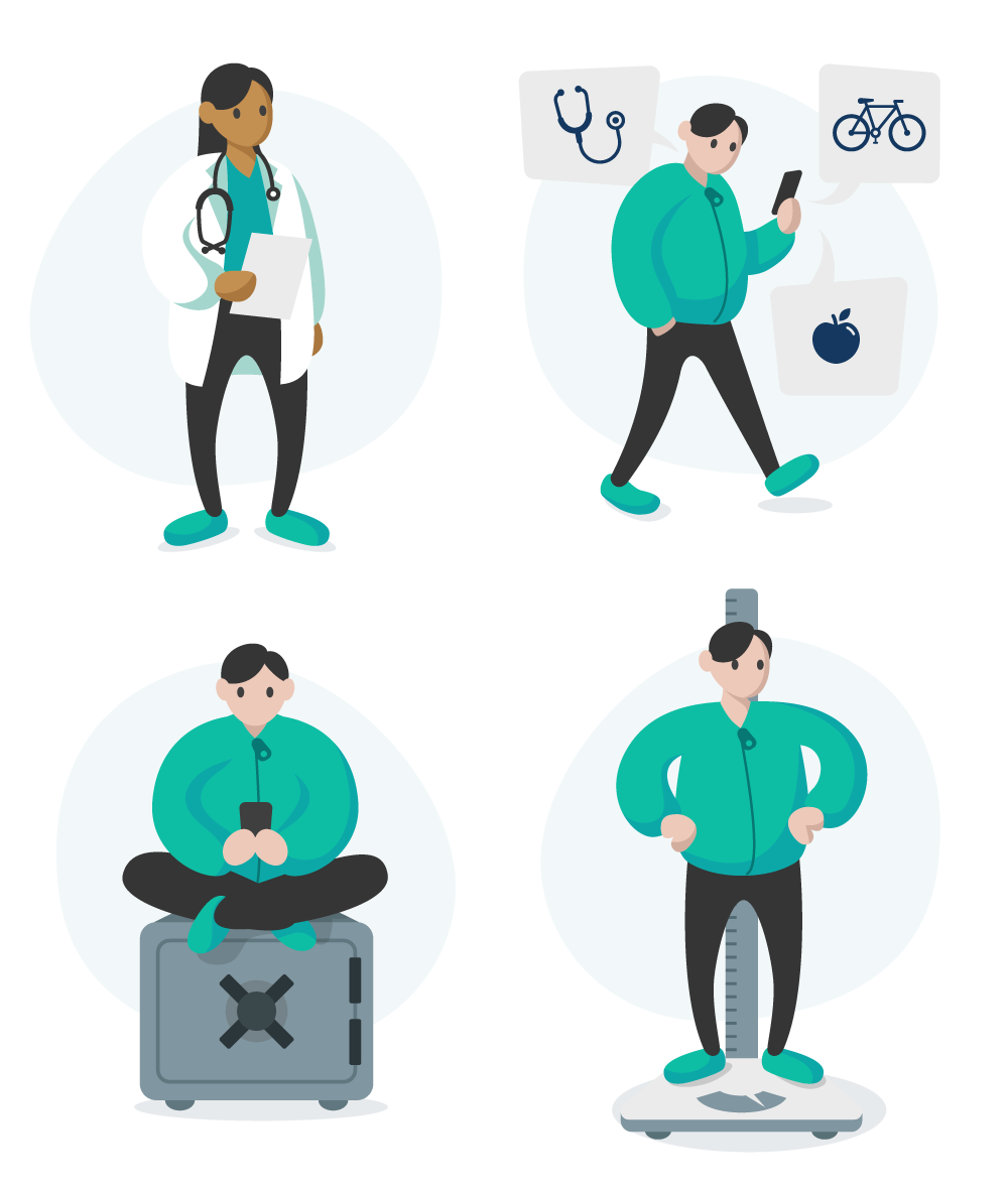
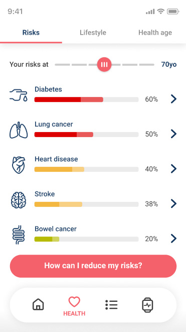
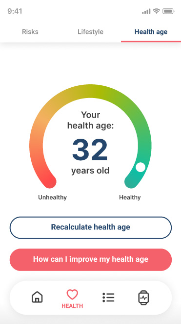
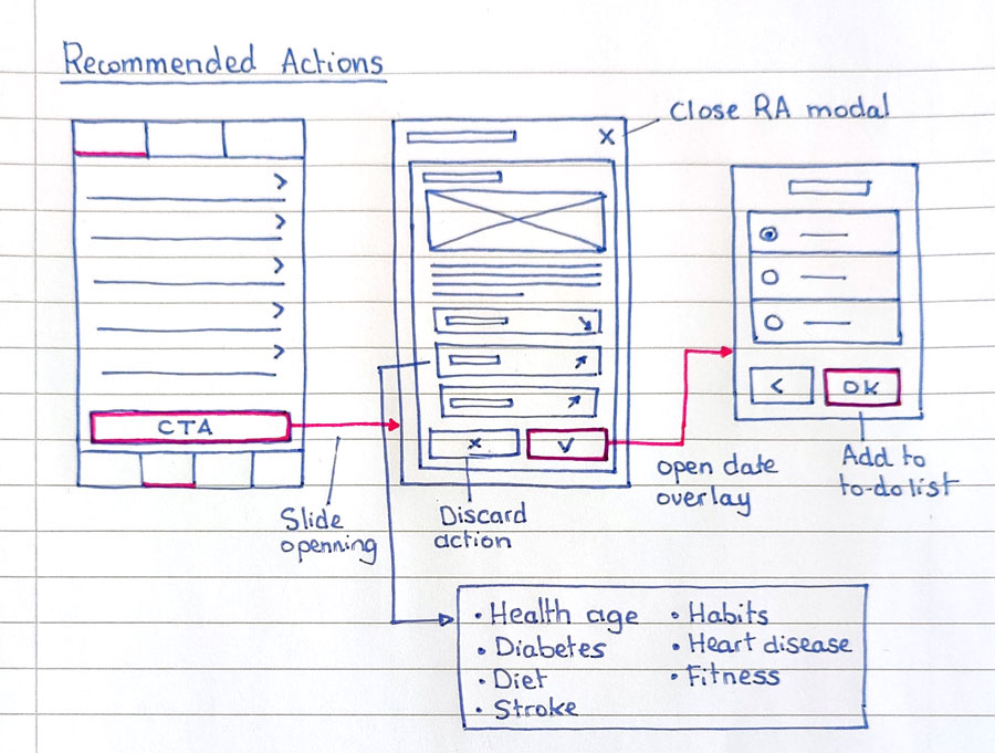
Wireframe
The flow and the wireframes went to multiple iterations. What started as an interaction and esthetic-focused app became something driven by the ability to customise it to the need of clients and users. Making space to allow new features and colours became a priority along with the clarity of results given in the health reports.
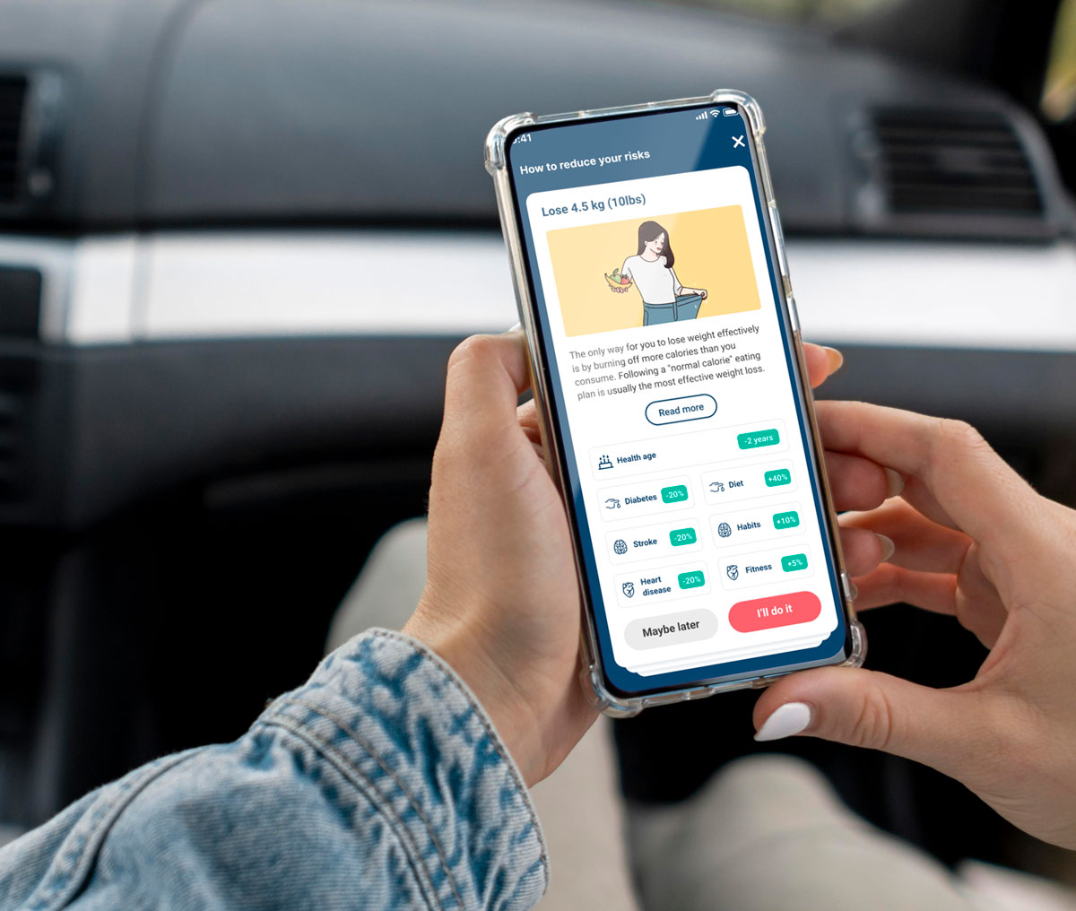
A particularly important focus was put on the way to show how the recommended actions were improving their health, showing both their current level and the evolution each goal could provide.
Prototyping
Illustrations